
I had other ideas though, I was thinking of the big and blousy form, such as bearded or crested irises. I knew the soil in our garden didn't suit these plants, but at least I could get some from the local florist.
The two forms of Iris we are most familiar with are bearded and crested irises. They each have four major parts:
Standards
Falls
Stigma flaps
Beard or Crest/Ridges

Above you can see where I have cut through two of the falls and petaloid style branches to reveal where the anthers are.
This may all seem very technical, but to me it is essential to really get to know your subject, especially if you haven't drawn it before. We may not be composing a true botanical illustration, but in botanical art/painting, we still need to portray the subject accurately and the only way we can do this is by becoming familiar with the flower's morphology.

This is how I supported my specimen. It is in a plastic orchid tube with water inside, supported by a retort stand. This worked well, as the subject was at direct eye level when sat at my desk. I also attached a piece of white card to the stand to cut out any items in the background that would be a distraction.

This was the flower I used for the drawing.
Now we are more confident with the flower structure, we can start to get the details down onto paper. For this exercise I have not measured the flower parts, but have drawn them at each stage by eye, ensuring that I am portraying the flower life-size.
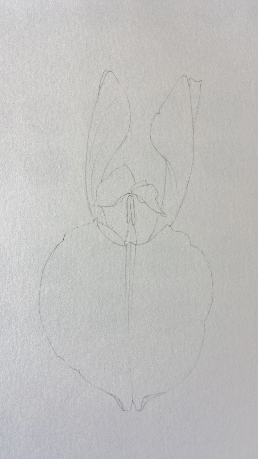
First I drew the front outer perianth segment (fall), taking note of the depth of the front central area. Drawing the flower from this angle means that I have foreshortening to deal with, and this was certainly the case with the crest and the anther just showing underneath.
Then I drew in two of the standards.

Secondly, I drew the right fall and then another crest.
What you have to consider when drawing a flower such as this, is where are all of the lines going behind the front fall? Even though you cannot see where they go, you still have to get the angles right where they are visible. The base of all parts meet just above and/or in the stylar column.

Thirdly, the left fall and crest was added and the rear standard. Because of the angle of the left fall, it was largely the back of the fall that was visible.

The lower lines were drawn in place to represent the sheath covering the stem.

The initial drawings above did not involve any detail to the fall and standard margins. The slightly 'crinkled' edge to the front fall was drawn in place prior to painting.
If this was a painting that I was continuing with, rather than a teaching piece, it is at this stage that I would add the finer details to the drawing.
Now for colour !

When it came to thinking about colour, I already had cool reds in mind, but what would I need in terms of blue ?
I created some mixes using Permanent rose (W/N) and also Anthraquinoid red (D/S) with two cool blues and two warm blues.
The cool blues were Indanthrene blue (W/N) and Winsor blue green shade (W/N) and the warm blues were French Ultramarine (D/S) and Winsor blue red shade (W/N)
Some of the mixes looked very similar to each other, but in the end I opted for the Permanent rose and French Ultramarine mix (second up from bottom).

During the lesson the students were 'itching' to get on and draw their Iris, so towards the end I gave them a demo of applying the first washes of paint.
I dampened the front fall first with clean water and then let the sheen of the water just disappear from the surface of the paper.
I then applied the paint from the edge inwards not taking it all the way to the centre, remembering to leave the white of the paper to represent the white part of the fall.
Because the paper was slightly damp this gave me the flexibility to keep the paint moving and enabled me to then soften the purple wash with a clean brush and water near to the centre of the fall.
It was also an extremely hot afternoon, so dampening the paper allowed the paint to dry a little slower.
Once this wash was dry, I then made the paint mix slightly stronger with the same colours and with the tip of a size 2 brush, added some of the veins visible on the falls. The left side of this fall was very flat, with no creases, but the other side was more creased.
As time ran out of our 2 hour weekly session, the rest of the flower will have to wait until next week's class and when I have made another trip to the florists !
Perhaps Iris aren't so frightening after all ? !
Happy painting !