Wednesday 22 April 2015

A new HP watercolour paper from St. Cuthbert's Mill

A short while ago I took part in a paper trial with a few other artists.  The purpose of the trial was to have a go at using an alternative hot press paper created by St. Cuthbert's Mill and give feedback on our results.  The Mill makes Saunders Waterford and Bockingford, as well as other papers.

I had 2 papers to use.  The traditional Saunders Waterford HP in high white and the trial paper in high white.
Above you can see the different swatches that I first created, using different painting techniques.
My initial thoughts were that I couldn't seem to get an even first wash on the paper, but as I continued, especially with an actual painting, this didn't seem to be an issue.
 
I also used an eraser on the paper to see if the surface of the paper was damaged at all.  I used a plastic eraser and also a softer 'gomme' eraser.  The paper surface stood up very well to the erasing and when I applied a watercolour wash over the area, the paint dried smoothly with no signs of paper surface damage.
 
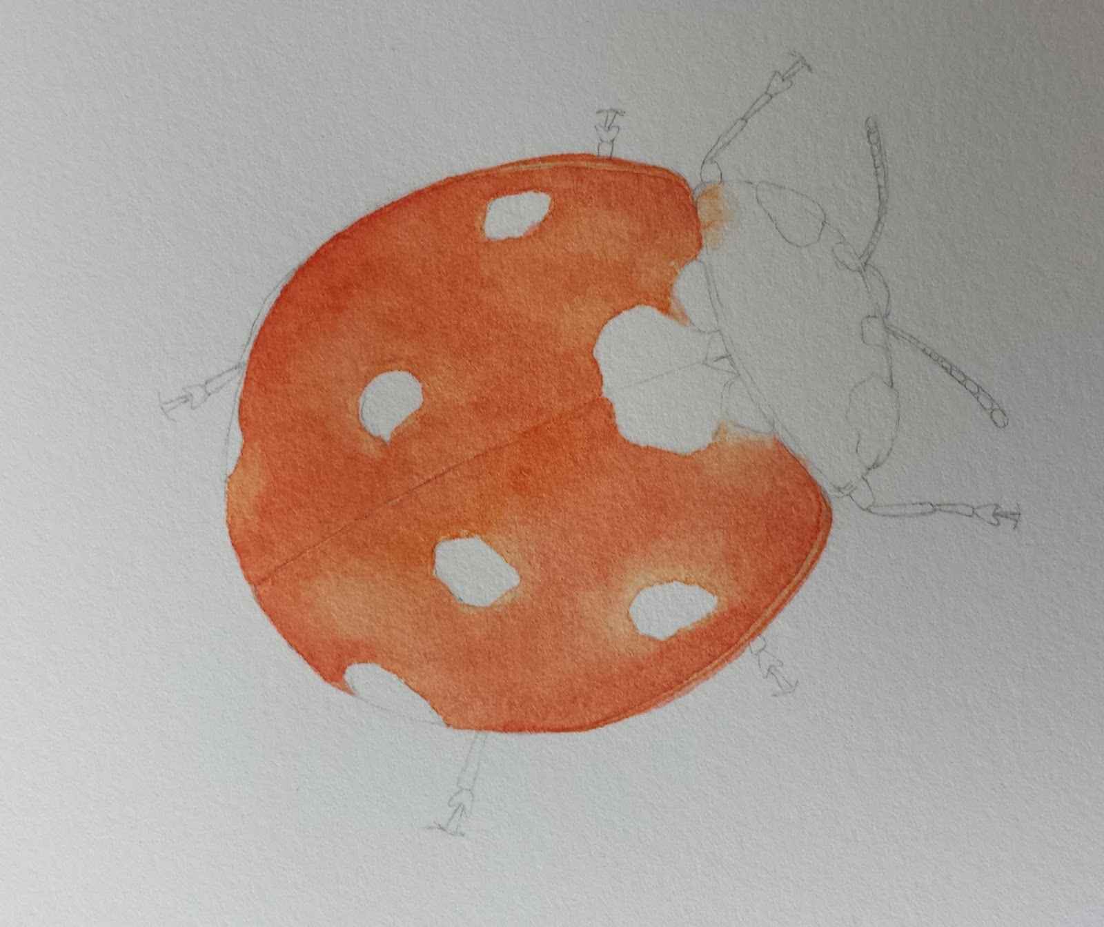
I decided to paint a Seven-spot ladybird on the trial paper.  I wanted to see how I could build up the initial washes and the depth of colour that could be achieved.  The picture above was in the early stages.
The colour intensity was retained as I progressed further and I found it very easy to lift areas of watercolour too.
 
I would like to stress that these are only my opinions, other artists may have had different results, dependant on their painting style and techniques they used.
 
 
The good news is that a new HP paper will be produced by the Mill in the near future.  It will be called Saunders Waterford High White Super HP and will available in 300gm (squared) (140lb) and 425gm (squared) (200lb).
 
I certainly look forward to using this new paper and hope to use it alongside my favourite (and the one I have a stock of), until I decide whether to just use one of them.
 
A nice gift in the post today from St. Cuthbert's Mill - traditional Saunders Waterford HP
 
If you would like to read more about choosing watercolour papers for botanical art, why not have a look at:


Friday 10 April 2015

Illustrating Spring flowers


Not long now until my next course at the Kingcombe Centre.
 
This place and the surrounding hedgerows, meadows and other habitats, are inspiring all year, but especially in the Spring !
 
The course starts on the Tuesday evening and finishes on the Friday afternoon.  So whatever level of experience you have there will be plenty of opportunity to really get to know your plants, and produce an illustration of your discoveries.
 
There are residential and non-residential options available.  For more information go to:
 
 
The Natures Details Spring and Summer Newsletter has now been published with news of an exciting new course coming up in October, along with other botanical art news. 
 
To read and download the newsletter click on the newsletter picture at the top of the right hand column or below
 

Wednesday 1 April 2015

Working with an Art Society

Over the last few months I have been lucky enough to be working with a local art society. 

Originally, it was just to cover their weekly 2 hour classes for a few weeks, and now I am continuing until June !


It has been a refreshing change for me.  Mostly, to do with the subject matter.  Not everybody favours a more detailed approach to drawing and painting, so I have had to think of subjects that suit will a variety of painting styles.

I wonder why some people are 'terrified' of detail and look upon it sometimes as a more negative approach to drawing and painting.  Hopefully I have reduced some of that fear and negativity, I'd like to think so.


One of the paintings from the marine themed week
 

A variety of pens to use for the pen and ink themed week and examples of my work.


The stages of a painting of Oyster shells using pen and wash.


Banksia pods depicted using different inks.
Top: Black Quink ink
Middle: Sepia ink
Bottom: Acrylic inks


You can achieve some wonderful effects using black Quink ink.  The pigments in the ink separate when they come into contact with water.  Quink ink is the traditional type of ink used in fountain and cartridge pens.
 

A Lotus seed pod in water soluble inks from a brush pen, and watercolour.


Over the last few weeks we have been using texture paste and other media to depict the texture of brick walls, stones and geological formations.
 
Don't forget that quite a lot of my personal artwork is focused on Art and the Hedgerow at the moment.  You can find out more on the Art & the Hedgerow Blog.
 
Happy painting !