Thursday 31 December 2015

New Year, New Sketchbook (or 2), and new Subjects

Where has that year gone ?!

It has flown by for me, with various challenges along with the way, but there are several constants that are always there - my family (and very tolerant husband), my friends and yes you guessed it, my love of art and the natural world.

What has been truly special this last year has been the number of people that have become interested in botanical art and natural history illustration.  Some of them have been coming to courses and workshops for a few years now, one lady for 10 years !  The Natures Details Summer School courses were a joy to teach and what made them special was the learners' infectious enthusiasm and the sense of sharing that with everyone, along with the beautiful venue in the South Downs National Park, in Hampshire UK.  There are more courses to follow in 2016 - starting earlier this year in March.  Go to the website for more info.


The view from the 'Old Tractor Workshop' - venue for the Natures Details Courses

The botanical art courses at Peter Symonds College AHED in Winchester are very popular, with a 3rd class having been introduced in September.  Last term I had 35 students in total and next term looks about the same.

As for my own artwork, subjects were varied this year.  Several focused on my current project 'Art & the Hedgerow', which is leading up to the completion of another selection of paintings that will be exhibited at the RHS London Botanical Art Show on the 26th and 27th February.

Butterflies proved popular subjects too and this will continue into 2016 with a specific Butterfly & Moth Illustration course to be held at the Kingcombe Centre, Dorset in July.

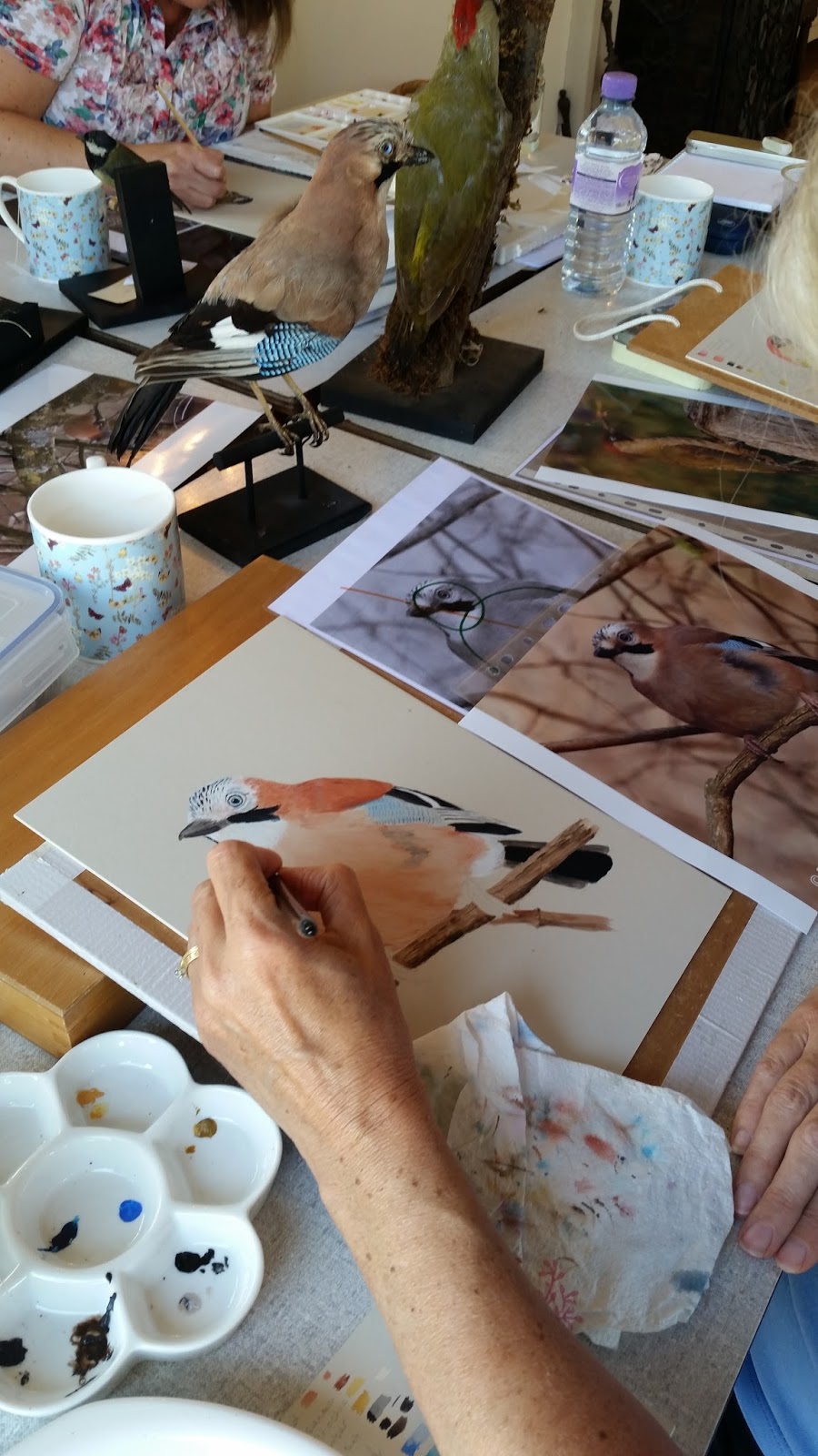
I am hoping to complete some new butterfly and moth illustrations looking at their ecological relationships.  Birds will no doubt play a part as well and this has already started with a drawing of Beebo the Tawny owl.  He was one of the owls that visited us for the Sketching Owl's course in October.  This drawing will also be making a special appearance in the not to distant future, although more about that to follow soon.

Beebo the Tawny owl

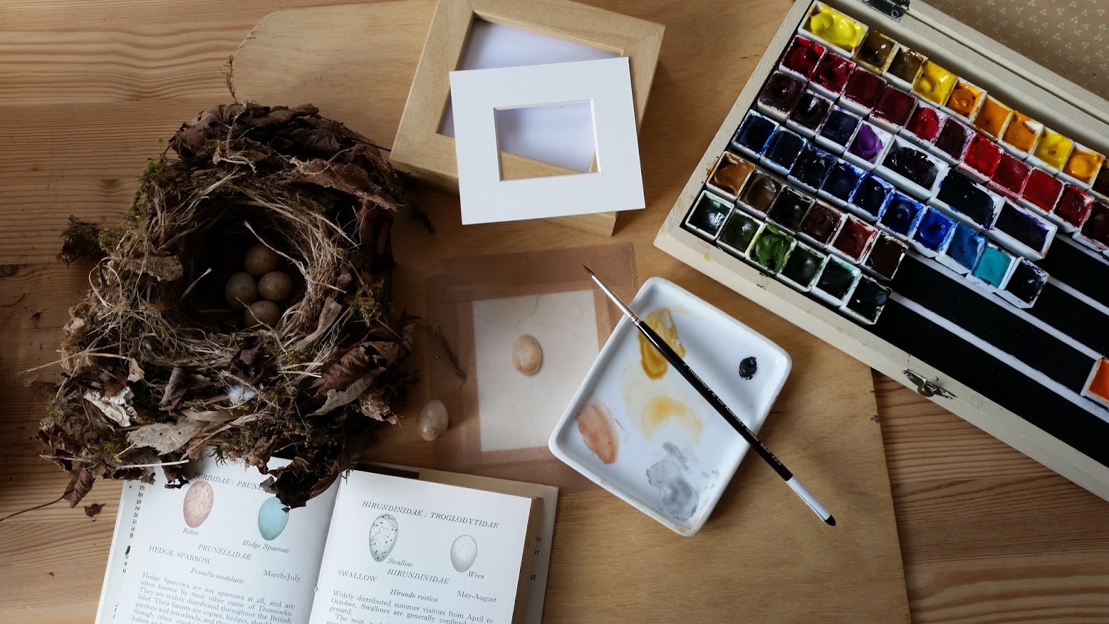
Onto sketchbooks.  Many of you will know about my love of sketchbooks and this is great, but up until now I have never been able to complete one.  Well this year I have managed it, even filling two in the process !

They are used in several ways: sticking 'lost' drawings and paintings in, creating detailed study pages, quick sketches, exercises for use in courses and lastly, they are a place for me to explore my love of nature in.

This year's sketchbooks - A3 in size and made by Pink Pig in Yorkshire, UK.  The bottom sketchbook is my RHS project one and is still very much in use.

So here is a selection of pages from my botanical and natural history sketchbooks of 2015.

Wild garlic 

Kingfisher - sketched from museum specimen

A popular page used in several courses this year.  Painted lady butterfly.

Happy memories from a wonderful summer day spent with my friend and artist Susan at Old Winchester Hill, who had come all of the way from Vermont.

Preparation for a vellum painting - A View Inside - Foxglove.

A lost and found painting added to the back of the natural history sketchbook. Goldfinch.

Sketches and colour trials (also on vellum) of peaches from the stunning peach house at West Dean Gardens.  It was so hot and almost impossible to paint, but the smell from the ripening peaches was divine !

A wonderful Autumn day sent with Claire from Drawn to Paint Nature sketching fungi in the New Forest, Hampshire

The new sketchbooks ready and waiting.

As they get dragged around everywhere with me I make fabric bags for them to go in.
This year there will be two A3 Amelie watercolour sketchbooks along with an 8x8 inch version, which will be just for butterflies, moths and other insects.


There have been two pieces of good news this week, helping to kick start the new 'botanical art' year.

I was thrilled to be one of the featured botanical artists in Garden News Magazine this week (2nd Jan issue).  The article was perfect in showing how botanical art and gardening can go hand in hand.

Secondly, Anne-Marie Evans who created the first ever Botanical Illustration Diploma Course in the UK, was awarded an MBE in the Queen's New Years Honours list, for her services to Botanical Art and Education.
I am sure that many people are thrilled that she has been awarded this and it is also good news for botanical art too.
Read more about it here: News from Botanical Art and Artists


All I have to do now is wish you a very happy, healthy and creative 2016.
Thank you to everyone that follows this blog and the exploits of Natures Details elsewhere.

Happy painting !

Sarah 

Tuesday 8 December 2015

Seeing things - vascular bundles

My love of plant morphology certainly extends into my botanical drawing and painting it would seem strange if it didn't.

Whilst completing the paintings for my RHS project I am drawn ever closer (excuse the pun), to the details I am illustrating, especially as some of them are x20 lifesize.  You even begin to start seeing things - yes I am not joking !

Most recently I have been painting my 3rd attempt at a Hazel bud, yes third, and I think  have finally cracked it.  The bit that was the most challenging was believe it or not the leaf scar.  This is usually found just below the bud and is where the leaf from the previous year was attached.

A Horse-chestnut twig showing the morphological features of a twig.  The leaf scars on this tree species are characteristically quite big.

On the surface area of the leaf scar is usually some small spot like features, when viewed life size. These are called the bundle scar and are actually the ends of vascular bundles.

What are vascular bundles ?

A vascular bundle is a part of the transport system in vascular plants. The transport itself happens in vascular tissue, which exists in two forms: xylem and phloem. Both these tissues are present in a vascular bundle, which in addition will include supporting and protective tissues.


So these bundle scars have proven to be a bit of a challenge, as their layout on the leaf scar is often regular in pattern and can at times represent a face - this has been the case with the Hazel.

It has been driving me a bit mad, but I have had to accept it, as the position of these bundle scars can be a feature used in identification, so I have to show them as they actually are.

The Hazel bud and twig WIP - see what I mean !

Guelder rose - not so much of an issue

A very small bundle scar on the Field maple

Ash - only the edge of the leaf scar is visible below the lateral bud


I accept the challenge of the bundles and will carry on regardless !

On a positive note I have had confirmation from the RHS, and will be exhibiting this series of paintings at the RHS Botanical Art Show at the Lindley Hall in Westminster, London, on Friday 26th and Saturday 27th February.

For further information about the show follow this link: https://www.rhs.org.uk/shows-events/rhs-london-shows/rhs-london-botanical-art-show


Saturday 7 November 2015

Hairy buds - how do you paint them ??

Well, this is the dilemma that I have been facing over the last year.........

Painting twigs and buds almost x20 lifesize means that every single bit of detail shows, and yes you guessed it, some of them have hairs too.  Looking at the twigs with the naked eye, you would never believe that those hairs were even there !

This was the case with a Field maple twig, showing the terminal bud as well as the lateral buds.

The painting forms part of my collection of artwork, which will hopefully be exhibited with the RHS in 2016.  The title of the exhibit is: Twigs & Buds in Winter - from Trees & Shrubs of Ancient Hedgerows

So far this painting has been the most challenging, and in the lead up to it I tried several ways of depicting the fine hairs found on the buds and twig.
  • Using masking fluid - I can't stand the stuff but I gave it a go trying several makes along the way !  I used a ruling pen, dip pen and a fine brush and just couldn't get the results that I wanted.
  • Using white gouache/body colour - this I am used to and I like permanent white, particularly the Daler Rowney one.  When I use it I tend to apply it to the area concerned in the painting and then add the colour on top, even though it is usually only a subtle hint of colour and often a neutral shade, such as a 'botanical grey'.  The gouache was just looking too blue, so back to the drawing board !
  • Painting the areas around the hairs - the negative space - I just wasn't brave enough to do this !

So what did I use ?

I came across this liquid acrylic made by Golden.  It is not acrylic ink, but is still quite fluid and can be diluted too.
What appealed to me was that it was available in Titan buff, which is like a very pale beige and a far more natural looking colour than a stark white.

The lightfastness rating was good and I also looked at the other properties, which were clearly marked on the back of each bottle.  I certainly didn't want shiny looking hairs, but I still wanted a good degree of opacity !

I tried out various brushes and I am especially a fan of spotter brushes, particularly the firmer ones, which tend to made of man made fibres and not sable.
Rosemary & Co Series 307 are proving useful and I opted for size 3/0, a size I wouldn't normally use!

The titan buff on my palette.  I had diluted it with a tiny drop of water.


The development of one of the lateral buds.  When you view a twig and bud through a microscope it is amazing how the colours are often more intense than if you saw them with the naked eye.

Initially for the tiny hairs on the bud tip I used a neutral colour to create some form and texture and then used the liquid acrylic to introduce the lighter hairs and create even more depth.


The hairs on the main body of the twig were of varying lengths and densities so this presented as another challenge !  Shadows under some of the hairs were painted in and if the liquid acrylic was still too bright, I toned it down with a weak wash of a colour that I sometimes call 'dirty paint water' !

At this stage some of the hairs still need more of a highlight, but not all along each shaft, but where the hair bends and hits the light.  (Thanks to a very helpful and good friend for advising me on this).


So there you are, I faced the challenge head on.  I'm not saying it is the right answer, and another time I may approach the same challenge differently, but I am relived to have now finished this painting.


Previously, blogposts relating to my RHS project could be found only on my Art & the Hedgerow project blog, but in the lead up to the project being finished I will be posting on both blogs.

I will be at the Kingcombe Centre in Dorset from Tuesday 17th to Thursday 19th November, working on the project.  So if you are around why not pop in and say hello and see me at work. 

Wednesday 28 October 2015

Exploring your art materials - Graphite pencils

As with all new art materials that I purchase, I always want to give them a thorough testing, especially before I make any recommendations.

We perhaps take our graphite pencils for granted at times and don't really give them the attention they deserve, thinking that they are a tool that takes us part way to producing a painted picture, if that is to be our chosen end result.

I have tried many graphite pencils over the years and I can be really fussy about how they perform, both for line drawing and for tonal shading. 

Things I look out for are:

* How smooth they are on the paper - I don't want to feel a 'gritty' sensation when I am using it

* I want each grade of pencil to have a good contrast across its varying degrees of tone, as well as across the whole range of grades - some of the cheaper makes of pencil will not have this contrast and I have often had students turn up with the cheapest pencils they could find, only to discover that an H performs just the same as a 2B, with hardly any difference in the range of tones each pencil produces

* It has to feel comfortable in the hand - is it the right weight and is the barrel shape comfortable ?

What are my favourites so far ? :

* Faber Castell 9000 graphite pencil

* Caran D'Ache Grafwood graphite pencil

So why use another ?

I have been hearing good things about Tombow Mono 100 graphite pencils, so I decided to try them for myself.  If I am pleased with them, I am hoping to use them for a new project, but more about that towards the end of the year !


The pencils can be bought individually, in boxes of 12 of each grade and also an assortment box, which contains grades 6B - 4H

This is a screen shot from the Tombow (Europe) website, with suggestions as to what various grades of pencils are useful for


How do I test them ?


The first thing I always do (and get my students to do before they even start drawing) is to test the tonal range achieveable with each grade of pencil.

To do this you need to produce a tonal strip which will show the darker tones, through the mid-tones to the lighter tones for each grade.  This will always depend on the amount of pressure you apply.

So to achieve the darker tones you apply more pressure and then as you progress further along the strip you lighten the pressure.


Whilst producing the tonal strips I prefer to hold the pencil like this as I feel that the pressure I apply can be controlled more easily.

At the softer end of this pencil range (especially 6B-3B) I found that I could achieve a really rich intense black without applying too much pressure.  There was still a variation between each grade though.  
So if I wanted a more intense black for the darkest tones of a drawing, I would use one of the softer grades of pencil and the 6B would give me the absolute darkest tone.

There was no feeling of 'grittiness' at all across the whole range.  I am especially aware of this as I move through to trying the harder grades (F - 4H).                           

I often use these grades for line drawing, both in sketching and more detailed work, so it is essential that I am happy with the feel and results.

Filling in small circles and creating tonal spheres is also a good way to see the varying tones each pencil produces.

I tend to fill each circle with graphite by creating very small ellipses, blending as I go so that no lines are visible. 

When creating these I would hold the pencil in the normal way as I would for drawing.

As I mentioned before in some makes of pencil the harder grades can still feel too soft and may shed some graphite as you shade with them.  From H to 4H I do not want to see this happening as I often like to overlay my tonal drawings with a wash of transparent watercolour. If too much graphite is shed this will make the watercolour look 'dirty' when the wash is applied.   The Tombow pencils in these grades were very favourable.


I hope that you have found this insight into testing graphite pencils useful.

Below is an example of where a graphite tonal drawing has had watercolour applied on top of the shading.

This beautiful drawing of a Barn Owl was produced by one of my students on a recent course - Sketching the Beauty of Owls 
Bronagh created an accurate line drawing first and then carefully put in areas of shading using H & 2H pencils.  The watercolour wash was then applied over the top, using a transparent mix of watercolours.  Where more depth of colour was applied, additional watercolour washes were added.

One of my graphite pencil sketches of a Tawny owl chick, drawn from a museum specimen.

Tuesday 29 September 2015

'A cracking good egg' - eggs and art

You know me, always fascinated by so many aspects of the natural world, and I am always up for illustrating subjects that don't always appeal to others.

Eggs are one of those subjects ......

 
This fascinating image of a variety of eggs was illustrated by Adolphe Millot (1857-1921), a French natural history artist who was Senior Illustrator at the Museum Nation d'histoire Naturelle.  The image was published in Paris by the Librarie Larousse (1897-1904)

It shows the eggs of various birds, a reptile, various cartilaginous fish, a cuttlefish and various butterflies and moths.


Previously I have had a commission for an illustration of Gull's eggs.  These eggs can only be collected under license and in the past the collecting of these eggs was common place along areas of the coast.  Many years ago they provided a rich food source, but in recent times they have become a delicacy in high class restaurants, with individual eggs costing a lot of money.

Now the license holders are few and far between.  Even though gulls seem common place in many of our towns and cities, in actual fact many of the species are in decline.

Gull's eggs can vary considerably in shape and colouration and can at times be quite elongated, like the one on the far right.


Quail's eggs are great fun to illustrate.

I was given a whole tray of Quail's eggs and many of them had some lovely colour combinations and patterns.  Most of them were considered too 'different' to be packaged up for sale in shops, so yours truly had the great opportunity to make her choice.  This has proved a popular painting, and several others have followed after this one was sold.

Hen's eggs - from Aurora, Twinkle and Star

Now for something a bit more subtle.  My friend gave me some freshly laid eggs and prior to cooking them I did this quick sketch.  The Daniel Smith Primatek colours came in useful for this painting, although unfortunately I didn't make a note of which ones I used.


More recently, I was given a Robin's nest.  The nest had been abandoned in early summer and throughout the summer the eggs within had remained intact. 

Painting a tiny Robin's egg on vellum.  Once finished, this will be part of a series of small paintings which will be framed using the frame seen above.

The small book is the Observer's book of Bird's Eggs, a book I have had since childhood.

The subtle colours of burnt sienna, natural sienna, buff titanium and graphite grey were all used in this painting (all Daniel Smith colours)

The pale creamy colour of the natural calfskin vellum was perfect for this subject and the graphite grey watercolour was used for the areas of shadow.

Now for some COLOUR !


This painting I called 'Dream Eggs'.  After painting one of the Quail's Eggs paintings, I felt that I needed to splash some colour around.
All of the patterns and colours are created by me, although of course there are some similar representations in the natural world.


It is hard to believe that out of all of the entire array of egg colours and patterns, only two colour pigments are responsible - a reddish brown and a bluish green.  Scientists have been investigating this for many years, and it was only in the 1970's that progress was made.

To read more about this fascinating discovery go the Audubon website.

Hard to believe that all of these colours and patterns are the results of just two pigments !


For further fascinating facts about bird's eggs why not have a look and listen at BBC Radio 4 Natural Histories series of programmes ?

Happy painting !

Sunday 23 August 2015

Drawing Birds - here's one approach

After another successful Summer School Course, this time illustrating birds, I thought some of you would like to see the approach I take to drawing these wonderful creatures.  I drew and painted birds before I ever took up botanical art work, and through my life I have taken several approaches before I settled on one that I use most of the time.  It was quite reassuring to find that other bird artists follow similar approaches, as I discovered when purchasing the book mentioned below.

As with a lot of natural history illustration, nothing beats drawing from life and working in the field.

John Muir Laws has several wonderful quotes in his book 'The Laws Guide to Drawing Birds'

'The purpose of field-sketching is to learn from nature.  Train yourself to look and look again until you see.  Do not worry about making pretty pictures; instead focus on documenting on what you earn during a direct encounter with nature'
 
'A field sketch is not about making a perfect illustration; instead it is a tool that allows you to look more closely'
 
'The sketching process cements memories in your mind'
 
This very quick pencil and wash sketch of a Blue tit was one of my very fist field sketches.  It is very small and only measures about 6 x 5 cms.  It still sits a bit tattered on my pin board in the studio.
In reality sketching out in the field is not always possible.  When starting to draw birds it can be daunting sitting in a public place such as a bird hide or park, whilst people may look over your shoulder.  Using your garden is a different matter and I encourage this as much as possible, when observing birds but also when starting to make the first few tentative sketches.  Remember, nobody else has to see them !
 
I can hear you saying 'what about using photographs ?'  This is often frowned upon by some natural history artists, some of the reasons I totally agree with.  But using photographs alongside other resources can create a more holistic approach and encourage people to actually get out there to sketch too.
 
The resource table at the Summer School Course.  Not only photographs but also taxidermy specimens of birds, bird id guides, books from bird illustrators and examples of other artwork.
If using photographs you do need exceptionally good images and I am lucky that I have a good library of my own images, but also access to other images from a photographer friend.
 
For the Summer School we used the resources seen above all in combination with photographs. 
 
Each coloured photo had an accompanying black and white image, as near to scale as possible.  This enabled the students to really look at the details without being distracted too much by colour and pattern.

The central red line is the first line that is always drawn.  This helps to indicate the posture of the bird.  The angle of this line can vary considerably according to what the bird is doing.

If this line is drawn accurately, the rest of the drawing becomes easier.
 
The two green circles/ovals seen above in the first picture of course indicate the approximate shape of the body and head.
I have always found it easier to draw the body shape first, rather than the head.  If drawing the head first it is very easy to make it too large.

Once these two circles are accurate the outline of the bird can be drawn in.  Dependant on the position of the bird, some of these lines may be quite angular, so be aware of the outer shape and be careful not to make a bird look too rounded.

 
For the other details look closely at the groupings of the feathers and the direction that they may take.  These groupings can sometimes go across several areas of patterns, according to what bird species it is.

For this drawing of a Wren there was not a great deal of colour and pattern variation when comparing it to a Great tit for example, but I still needed to observe the directions and groupings of the feathers.

The next stage is to ensure that the wing and tail feathers are accurate.  In addition the angle of the tail needs to look realistic too.
Next we moved onto painting our drawings using artists quality gouache on coloured mountboard.

I'll be talking more about using gouache for bird paintings in a later blog post

Can you guess what bird this paint palette was for ??


The bird illustrations taking shape as the we moved through the 2 days of the course.
 
We also had a visitor that stayed around for the second day of the course.


The final pieces.  Everybody worked so hard and really enjoyed discovering more about their bird species and how versatile gouache can be - more about gouache in a later blog post !
 
The next course will be even more exciting as we will be using live birds as our subject matter !
Cherry and her beautiful owls Beebo and Eddi from the New Forest Owl Studio, will be paying us a visit in October for the 'Sketching the beauty of Owls' course