Saturday, 26 July 2014

Busy Bees in the garden and a pop-up classroom !

This weekend we have seen an influx of bees in the garden.  This summer the buzz of bees in the garden has been reduced.  There is some thought that the very wet winter and then the early spring and summer may have had an affect on wildlife, and apparently there are already signs of an early autumn.
 
A few weeks ago this was reported in the Guardian newspaper, with National Trust naturalist Matthew Oates, providing some of the facts:
 

The Heleniums - Helenium Mardi Gras, have been providing a wonderful array of colour in the garden.  This is their 2nd year and they have really 'bushed' out.  These Honeybees have been taking full advantage of the ready supply of nectar. 
 
Below is a what I think is a Buff-tailed bumblebee  Bombus terrestris feeding on  Knautia macedonica 'Melton Pastels' 
 
Below is a bumblebee (unsure of species), feeding on Helenium 
 
 
Honeybee on Verbena bonariensis
 
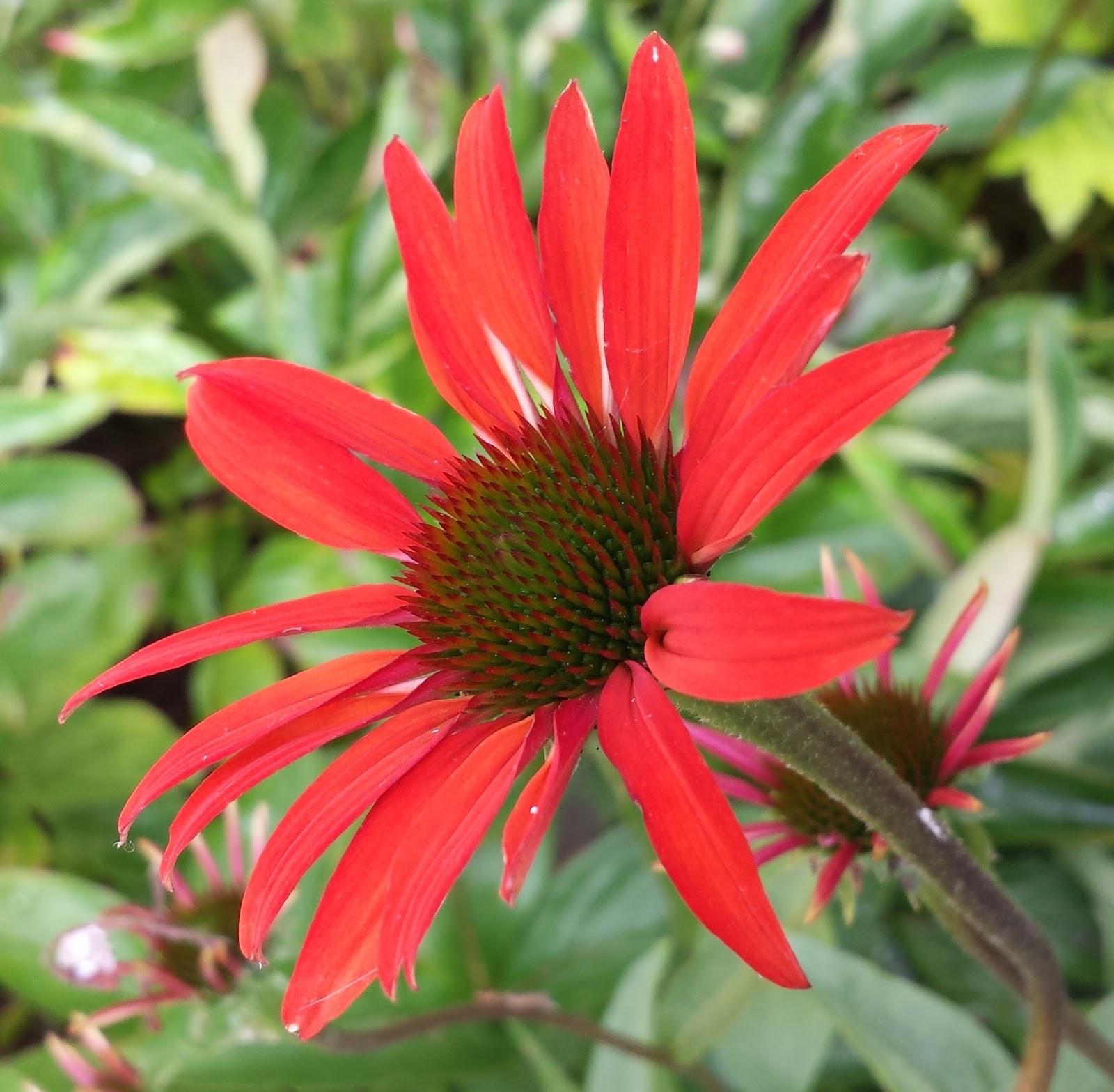
A new plant I have recently acquired is a newly introduced Echinacea.  It has a fantastic name - Echinacea 'Tomato Soup'.  Very apt for its redness !

 
A collection of flowers from the garden - what can you spot ?
 
The veg trough earlier on in the season
 
I feel that I have rather neglected our veg trough this year, and have not made full use of the space.  The lettuce has been good, growing Romaine in a cut and come again variety.
In addition the chard has done well, but is now being devoured by tiny caterpillars. 

The first crop of chard was softened in a saucepan with a little butter and then added to mashed potato with some grated cheese.  To finish off it was topped with mixed seeds and more cheese.  Real comfort food, yum !
 
Small carrots in the sketchbook.
 

 Now for the 'pop-up' classroom !  It's really just a gazebo that we picked up at a reasonable price.
This week my 'Workshops in the Garden' start.  There will be 3 over the summer with 3 or 4 students attending each.
As our garden is south-facing and is surrounded by a wall, it can get extremely hot and lately it has almost been a 'no-go' area in the afternoons because of the sun.
Our large sun umbrella was going to be used with the addition of another borrowed from Mum and Dad, but the gazebo does the trick providing more shelter so that all students can fit under it comfortably.
I'll post some photos from the first workshop later on in the week.
 
Happy painting !

Tuesday, 22 July 2014

'Beetling' around - drawing & painting a Stag Beetle

Thanks to one of my students telling me about an insect ID workshop that she went on in Winchester, I have now found the most wonderful place that will keep me in subject matter for ever, and I mean ever !

The museum service in Hampshire has a great HQ where all of the collections are stored, from historic costumes, to fossils and beetles !

I made an appointment a few weeks ago and I excitedly made my way there today.  I had requested the use of the Stag beetles that they had, and looked forward to a new challenge.

So this post is really going to be an overview of how I went about this challenge, from the first faltering steps when I just wanted to give up, to the conclusion whereby I had to give the feel of sheen on the wing cases.

  1. The first stage was of course to draw this magnificent beetle.  Luckily I was allowed to take it out of its storage case and have it on my drawing board.  Using a vertical line enabled me to get the symmetry just right.
  2. The first wash that I applied consisted of perylene maroon to lay down a red base to the wing cases and the mandibles.  I lifted off some colour to leave a bit of a highlight, and it was at this stage I was wondering if I was even going to succeed with this subject!  Two thin bands of yellow were added and this was created from quinacridone gold deep (DS) and Naples yellow (OH).
  3. Because the further washes were much darker, I was able to build up the colour to rectify my initial concerns.  Normally I mix my own 'blacks', created from either 3 warm or 3 cool primaries.  Today, as I knew I was painting in a new environment, I took the easy step and used a colour called neutral tint.  I then added other colours to it as I built up the detail and form.
  4. The mixes were: neutral tint, perylene maroon, and a tiny bit of Sennelier yellow light.  This gave me a brown-black.  For additional intensity I upped and changed some of the colours and continued with this mix.  It was neutral tint, perylene maroon, indigo (DS) and hansa yellow light (DS).  I try and use no more than 3 pigments in a mix normally, but for me this combination happened to work and it gave me a dense black.
  5. When it came to painting the legs I used the latter colour, firstly using it diluted and then building up the layers with a size 2 round brush.
 
6.  Once all of the areas were painted, I touched up and added some more perylene maroon where needed.
7.  Now for the white gouache.  I always have a tube of permanent white gouache in my kit.  I don't often use it for botanical work, but for some subjects it can prove very useful.  I applied the gouache to create the sheen on the wing cases and highlights in other areas, with a size 2 spotter brush.  For the wing cases I applied the diluted gouache in small areas and then softened the edges of those areas with a slightly moist and clean brush.  In other areas the gouache was applied in a stippling motion creating tiny white dots.     
 
Paints used were Winsor & Newton unless stated otherwise:
DS - Daniel Smith
OH - Old Holland
 
Please remember that all images are protected by copyright and must not be copied in any form.  Thank you.
 
For further information on drawing and painting insects John Muir Laws has a video on YouTube:
 
 
As well as several blog posts:


Sunday, 13 July 2014

Painting the colour of chocolate - the challenge of a Chocolate Cosmos

During a delightful visit from Jarnie at Sketchbook Squirrel, I set us a challenge of finding the perfect colour match for a flower known as a Chocolate Cosmos.

I had heard of this flower a number of times but had never grown one.  To my amazement it is not only the colour of chocolate but also smells like it !


In the above image the flower looks rather red and perylene maroon is a colour that definately comes to mind.  In other light the flower looks intensely dark with a velvet look to it and a rich dark brown, almost black.


I was working in my Stilman and Birn Zeta Sketchbook and decided after the colour tests to just paint a petal.  Whilst mixing the initial washes I tried to ensure that I used no more than 3 colours in each mix.  Each paint colour that I used consisted of a single pigment, with the exception of indigo.  

This is a colour that I have only just returned to using again.  I had always avoided it in the past because it has black in the pigment mix and is also often an opaque colour, as well as being incredibly staining.

Without diverting from the subject of the cosmos too much, the indigo that I now use is manufactured by Daniel Smith.  It consists of 2 pigments PB60 and PBk6, a blue and a black, but the great thing about it is that it is transparent.  Another well known make of watercolour paint has different properties in its indigo watercolour - 3 pigments PBk6, PV19, PB15, it is opaque too.

Back to the cosmos - the final mix I decide upon was the bottom 3 colour tests.  The colours I used were indanthrene blue (W&N), piemonte genuine (DS) and a touch of Old Holland magenta (which is a quinacridone colour PR122).  This mix was used in varying degrees for the single petal and then dry brush work was used to finish it off in perylene maroon with a touch of piemonte genuine.

My initial colour tests are mixed quite dark and then I soften the colour strip with a moist, clean brush.  This way I get to see the tonal value I can achieve with that mix.

That wasn't the end of it though !  When I looked at a flower the next day there was far more of a red base colour.  So I set to again and took these steps .....

A base wash of perylene maroon applied first

Subtle ridges and detail in each petal created with a mix of piemonte genuine and indanthrene blue

The depth of colour was increased using the dry brush technique with a mix of perylene maroon and indanthrene blue

The finished painting trial and I'm still not sure if it is quite right.  Never the less exercises like this are a great way to really get to know your colours and what you can achieve with them.


On another subject, we had the moth trap out last week to see what moths were flying around our patch. Alas, nothing significant showed up, so we will have another go soon.  


Friday, 4 July 2014

The Garden as Inspiration and Respite

A garden can be a wonderful respite from the day to day routines and work.  A significant thing for me and many other people is that it can also be a place to go, apart from the four walls of your house when you are restricted to your home through ill health.  This can have an impact no matter how long that restriction can be - it can be a week, a month, or even longer.

Our garden is small and is sort of a 1/4 of a circle in shape.  It looks as though it takes a lot of work, but believe me, it is quite manageable.  The advantage being that when we re-designed it two years ago we filled it with perennial plants. The majority of them come up year after year, and some of them are packed tightly, so there are no room for weeds - hence not a lot of weeding is done !  Other delights include planting annuals in the many pots.

The garden during the day ......
 
and in the evening, just after watering - peaceful
 
Each year there are many subjects from my garden that I would love to paint, and I am finding that sometimes the pictures created from them may be created over several seasons or even over a couple of years.
 
One such subject is a David Austin rose called The Lady's Blush.  This I bought as a bedraggled specimen from the garden centre, looking very sorry for itself and bonus, it was also reduced to half price.  I didn't hold out much hope for it.  It bloomed last year but then had wilt and later on produced a few lovely red hips.  This year I have certainly not been disappointed and it has had so many blooms on it - and no wilt !
 
I had painted a sketch of the hip last Autumn so I had that to use, and a few weeks ago I set to composing a picture of several elements of the plant.  I didn't think too much about composition, I just wanted it to evolve and most of all I really wanted to enjoy painting it.


Left - the rose hip painted last year in my Zeta sketchbook.  The other 4 pictures show how I painted the hip in the main painting.  Initially I dampened the paper, let the sheen of the water go off a bit, and then added cerulean blue (where the highlight is), pyrrol red (DS) and Sennelier yellow light.  Further areas of colour included pyrrol orange (DS), quinacridone gold (DS) and perylene maroon(W&N).  I used a size 2 brush first (Isabey Series 6228) and then used a size 1 spotter (Rosemary brushes).
 
 
Development of the bloom.  The colour of this rose is what I call a gentle pink.  I had the perfect colour in my palette - rhodonite genuine by DS.  Again, I moistened the petal area I was working on first and then carefully laid on the colour.  The advantages to wetting the paper beforehand are: 1)  It slows the drying time in this hot weather 2) It allows more manoeuvrability of the paint on the paper, most importantly, it is easier to create a softer transition between the edge of the paint where it meets the paper.  This applies to the areas of the petals that I wanted to retain as white (the colour of the paper) or paler colours.
 
 
I also added a shadow colour to the petals where it was needed.  I tend to steer away from shadows normally, but I took a deep breath and mixed up a colour.
To create a neutral or shadow mix I would normally use my 3 main cool colours or my 3 main warm colours.  This time I decided to take a short cut - I used shadow violet (DS) with a touch of the rhodonite genuine in it, and watered it down considerably.  I think it works ....... maybe.
 
 
As I mentioned before, I took a freer approach to composition, this led me to adding some of the stamens.  These were so small, pale and delicate that I also used some of the shadow mix to give the impression they were laying on the paper.
 
 
There were also tiny red glandular hairs around the edges of the sepals.  The spotter brush came in handy for these too !
 
 
The finished piece - with a little scroll added to finish it off.


As you can see from the above montage, there is plenty to keep me going.  Not all of these are on the painting list but what better way to paint a flower than to have the scent of chocolate wafting over the paper.  Yes a flower that smells of chocolate !  The plant concerned is the Chocolate Cosmos (the small picture centre bottom).
 
Well, what's next ?  Some painting of birds, course planning for the next academic year and some very special planning of artwork for next year's exhibitions !  Oh and of course, next week Sketchbook Squirrel is paying me and the garden a visit - can't wait !