We perhaps take our graphite pencils for granted at times and don't really give them the attention they deserve, thinking that they are a tool that takes us part way to producing a painted picture, if that is to be our chosen end result.
I have tried many graphite pencils over the years and I can be really fussy about how they perform, both for line drawing and for tonal shading.
Things I look out for are:
* How smooth they are on the paper - I don't want to feel a 'gritty' sensation when I am using it
* I want each grade of pencil to have a good contrast across its varying degrees of tone, as well as across the whole range of grades - some of the cheaper makes of pencil will not have this contrast and I have often had students turn up with the cheapest pencils they could find, only to discover that an H performs just the same as a 2B, with hardly any difference in the range of tones each pencil produces
* It has to feel comfortable in the hand - is it the right weight and is the barrel shape comfortable ?
What are my favourites so far ? :
* Faber Castell 9000 graphite pencil
* Caran D'Ache Grafwood graphite pencil
So why use another ?
I have been hearing good things about Tombow Mono 100 graphite pencils, so I decided to try them for myself. If I am pleased with them, I am hoping to use them for a new project, but more about that towards the end of the year !
The pencils can be bought individually, in boxes of 12 of each grade and also an assortment box, which contains grades 6B - 4H
This is a screen shot from the Tombow (Europe) website, with suggestions as to what various grades of pencils are useful for
How do I test them ?
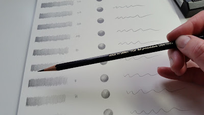
The first thing I always do (and get my students to do before they even start drawing) is to test the tonal range achieveable with each grade of pencil.
To do this you need to produce a tonal strip which will show the darker tones, through the mid-tones to the lighter tones for each grade. This will always depend on the amount of pressure you apply.
So to achieve the darker tones you apply more pressure and then as you progress further along the strip you lighten the pressure.
Whilst producing the tonal strips I prefer to hold the pencil like this as I feel that the pressure I apply can be controlled more easily.
 At the softer end of this pencil range (especially 6B-3B) I found that I could achieve a really rich intense black without applying too much pressure. There was still a variation between each grade though.
There was no feeling of 'grittiness' at all across the whole range. I am especially aware of this as I move through to trying the harder grades (F - 4H).
 I often use these grades for line drawing, both in sketching and more detailed work, so it is essential that I am happy with the feel and results.
Filling in small circles and creating tonal spheres is also a good way to see the varying tones each pencil produces.
I tend to fill each circle with graphite by creating very small ellipses, blending as I go so that no lines are visible.
When creating these I would hold the pencil in the normal way as I would for drawing.
As I mentioned before in some makes of pencil the harder grades can still feel too soft and may shed some graphite as you shade with them. From H to 4H I do not want to see this happening as I often like to overlay my tonal drawings with a wash of transparent watercolour. If too much graphite is shed this will make the watercolour look 'dirty' when the wash is applied. The Tombow pencils in these grades were very favourable.
I hope that you have found this insight into testing graphite pencils useful.
Below is an example of where a graphite tonal drawing has had watercolour applied on top of the shading.
This beautiful drawing of a Barn Owl was produced by one of my students on a recent course - Sketching the Beauty of Owls
Bronagh created an accurate line drawing first and then carefully put in areas of shading using H & 2H pencils. The watercolour wash was then applied over the top, using a transparent mix of watercolours. Where more depth of colour was applied, additional watercolour washes were added.
One of my graphite pencil sketches of a Tawny owl chick, drawn from a museum specimen.


